History
The Medicare Reservations site hadn't had much love for quite some time so the Senior Markets team came to myself on the UX team with a vision of adding new functionality to the site as well as making it responsive.
The Medicare Reservations site hadn't had much love for quite some time so the Senior Markets team came to myself on the UX team with a vision of adding new functionality to the site as well as making it responsive.
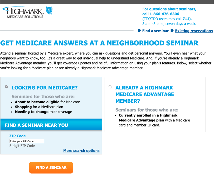
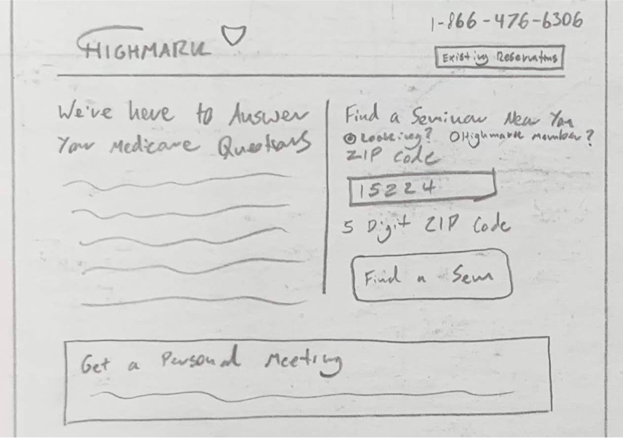
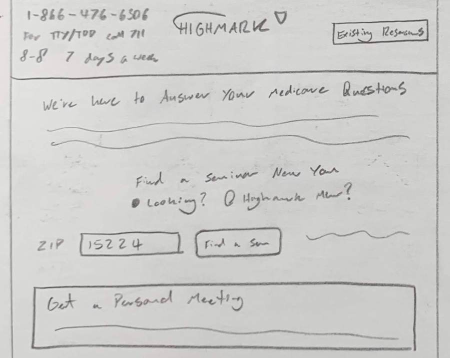
My initial sketches we're somewhat similar to the original site, as I thought that the layout actually made a lot of sense in terms on content hierarchy.
However, as discussions with the stakeholder progressed we realized that there were going to be 4 options for the sites users and not just 3 so we needed to rethink the experience for new users.
The main issue with these initial sketches is that each of the options was being treated differently and we decided it was the best approach to give each of the options equal weight so that the customer could choose what was best for them.
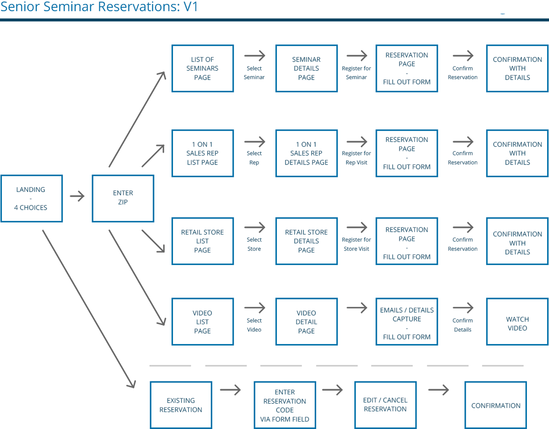
After the initial wireframing phase I put together a site flow so we could better understand how the site was going to work and also to hand off to the stakeholders so they could make sure that we we're missing anything content wise or in relation to the page architechture.
After we reviewed the initial wireframes and site flowchart I began to think about a tiled approach which would give each of the options equal weight and be easy to browse when a user first arrives on the site.
Upon reviewing this layout and starting to develop it further it became apparent that this wouldn't be a feasible option in the long term if the Senior Markets team decided to expand the sites functionality and add additional choices for the user.
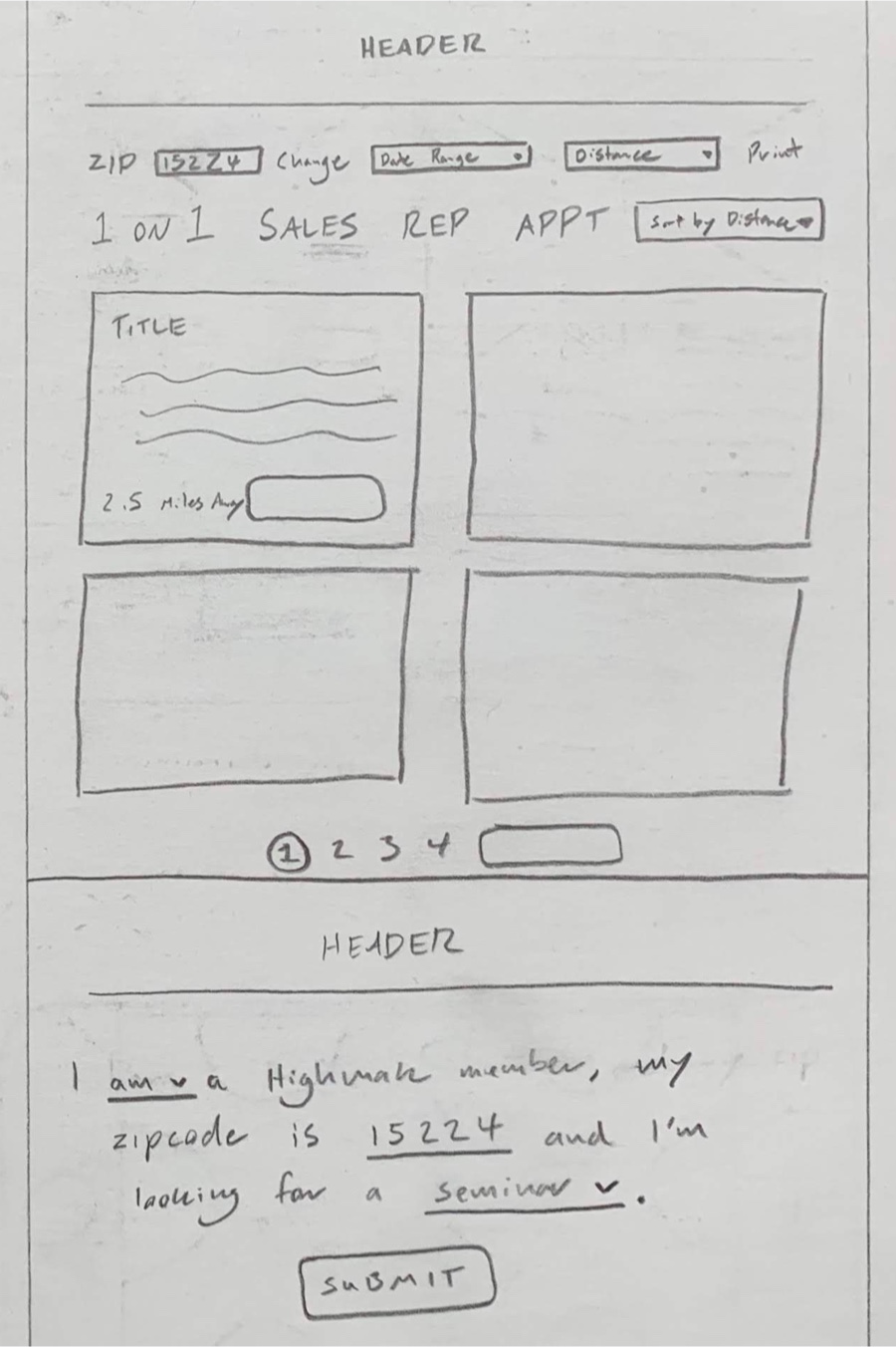
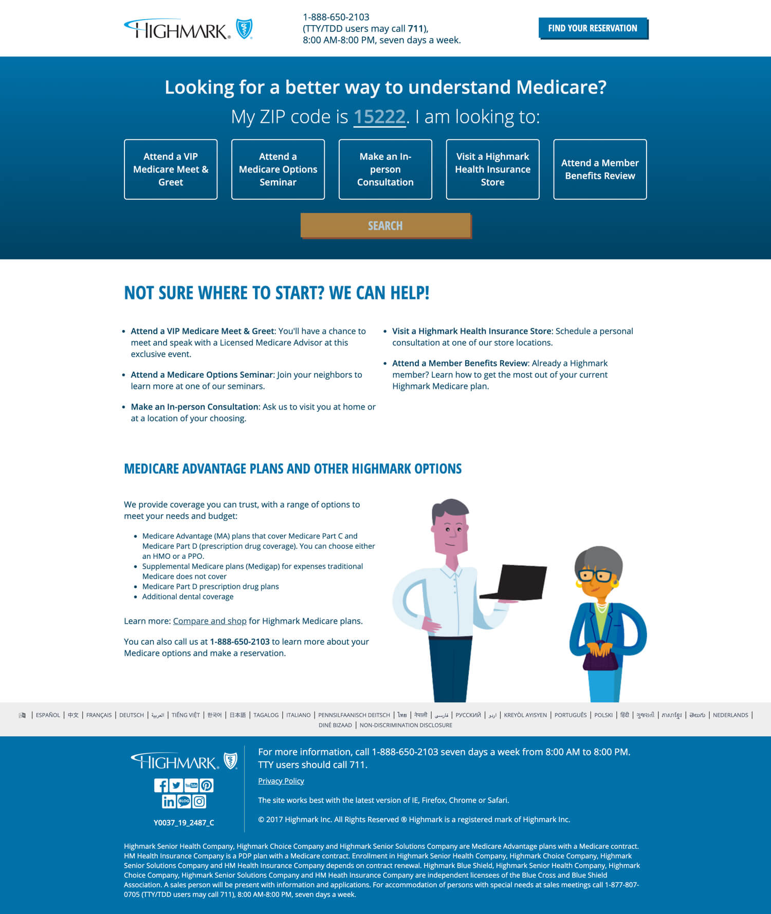
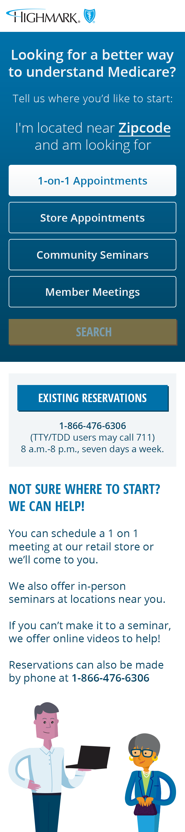
After some iterations when doing the hi-fidelity designs I eventually landed on putting the options all on one line in order to keep them together for users using older desktop/laptop computers with low resolutions.
Part of this sites functionality is based on the users ZIP code so they are served with the correct information based on where they recieve care – we applied a slight opacity to the search button in order to give users a hint they they need to perform an action before they can continue.
Overall, I'm really pleased with how this site turned out and based on the analytics and stats we've had back since it went live it has been recieved very well.